The phrase “3D animation” gets used in two totally different ways online. Sometimes people mean true 3D—a mesh, rig, materials, and a scene you can rotate forever. Other times they mean a 3D look—depth, highlights, and a sense of volume that reads well in motion, even though the result is still just a video.
Most creators I talk to are chasing the second one. They don’t want to learn Blender on a Wednesday night. They want a clip that feels more dimensional, more “presentable,” and more consistent than a random style filter.
That’s exactly how I treat a video to 3D animation converter in practice: not as a shortcut to “real 3D,” but as a controllable way to inject depth cues into a normal video so it reads like 3D on a phone screen.
If you keep that boundary clear, the workflow stops being mysterious. It turns into a checklist you can run before you hit publish.
3D look ≠ 3D model (and why that matters)
A 3D model gives you freedom: new angles, relighting, true parallax. A 3D-look video gives you a different benefit: speed and continuity. You’re preserving the original camera logic, then making the subject feel more “sculpted” through lighting, edges, and material behavior.
This also helps with expectations. When a result feels “off,” it’s usually not because the tool failed at “3D.” It’s because one of the depth cues is missing or unstable.
So I judge outputs the same way I’d judge good product photography: does it have shape, separation, and believable light?
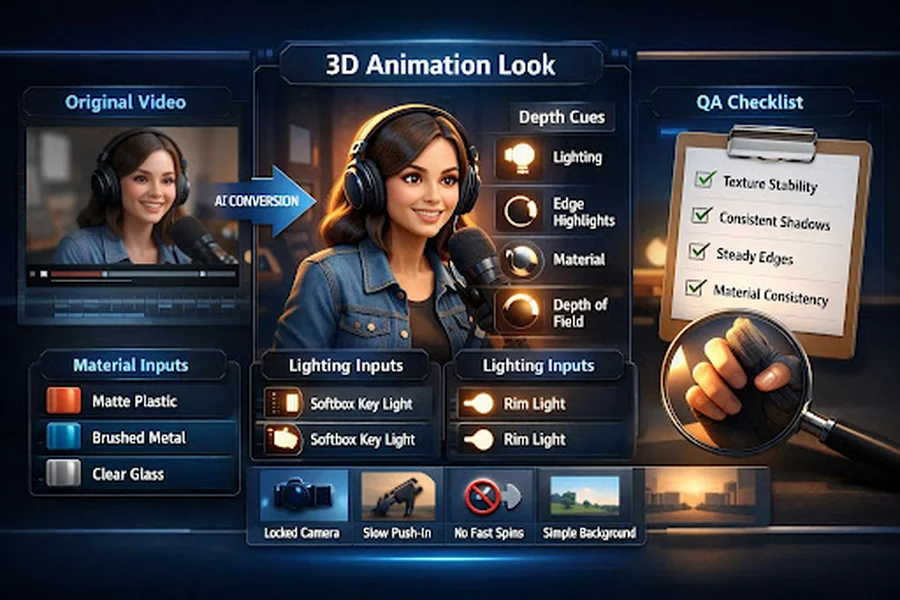
The four depth cues that make a clip feel 3D
When a conversion works, it’s almost always because it nails most of these:
1) Light layering (shape comes from light, not detail)
You want lighting that wraps. Even a simple key + soft fill reads more dimensional than flat ambient light. In AI conversions, “soft but directional” usually wins over “dramatic and chaotic.”
2) Edge highlights (your brain loves readable contours)
A subtle rim light or clean edge spec makes subjects pop from the background. The trick is subtlety—too much turns into a plastic outline.
3) Material response (matte vs glossy tells the truth)
Volume looks real when materials behave consistently. Hair shouldn’t flip between satin and velvet. Skin shouldn’t sparkle in one frame and dull in the next.
4) Perspective + depth of field (depth comes from setup, not luck)
Even mild depth separation helps: a subject at mid-distance, background slightly softer, no wild focal shifts. If everything is equally sharp, the clip tends to look “flat + filtered.”
I treat those four as a diagnostic checklist. If the clip doesn’t feel 3D, one of them is usually weak.
A plug-and-play prompt library for materials and lighting
I don’t write prompts like poetry. I write them like a short production brief: subject → materials → lighting → camera constraint → background.
Here are terms that consistently steer the “3D feel” in a predictable way.
Material dictionary (pick 1–2 per key object)
| Material intent | Words that usually work | Where I use it |
| Soft, non-reflective | matte plastic, soft rubber, powder-coated | toys, props, stylized characters |
| Premium metal | brushed metal, anodized aluminum, subtle micro-scratches | product shots, gadgets |
| Clean glass | glassy, clear acrylic, soft reflections | UI-like objects, modern scenes |
| Fabric realism | knit texture, woven fabric, soft fibers | hoodies, furniture, cloth |
Lighting dictionary (keep it simple and repeatable)
| Lighting intent | Words that usually work | What it fixes |
| Readable “studio” depth | softbox key light, gentle fill, controlled shadows | flat faces, muddy silhouettes |
| Strong separation | rim light, edge specular, subtle backlight | subject blending into background |
| Calm cinematic | soft window light, warm bounce, mild contrast | harsh edges, noisy highlights |
A small but important habit: once I find a combo that works, I reuse it across iterations. Consistency beats novelty when your goal is “stable 3D look.”
Camera and motion constraints: stability wins
If you want something that reads as 3D, the camera needs to behave like it belongs to a careful animator, not a roller coaster.
These constraints are boring—and that’s why they work:
- Locked camera or slow push-in (micro motion looks premium; fast motion looks glitchy)
- Avoid fast rotations (rotation amplifies warping and background drift)
- Small action amplitude (hands, head turns, subtle body movement tend to hold structure better)
- Simple background (busy backgrounds steal the model’s attention and trigger texture crawl)
In my own tests, the “3D look” is much easier to sell when the motion is gentle and the subject stays readable.
Common failures: what you see → why it happens → the one fix that works
This is the table I wish I had early on. I’m intentionally keeping it “single-change” focused, because changing five things at once makes troubleshooting impossible.
| Symptom | Likely cause | Single best fix to try |
| Looks like “blur + shimmer,” not 3D | too much motion detail competing with stylization | reduce motion (slower action, shorter clip, calmer camera) |
| Edges wobble or crawl | unstable contour interpretation | add subtle rim light / edge highlight language; simplify background |
| Shadows jump between frames | inconsistent light direction | specify one lighting setup (softbox key + gentle fill) and stick to it |
| Materials change mid-clip | too many style tokens or mixed material cues | remove extra style words; pick 1–2 material descriptors per object |
| Face feels different each moment | subject identity not anchored | tighten subject description (hair, outfit, angle), reduce dramatic lighting |
| Background “breathes” or morphs | background too complex | replace with cleaner setting; reduce clutter; avoid tiny patterns |
| Everything feels flat | missing depth separation | add mild depth of field + separation lighting (rim/backlight) |
If you only adopt one habit from this guide, make it this: change one variable per iteration. It keeps you sane, and it builds a repeatable playbook.
Output QA: how I decide it’s “3D” (not just stylized)
Before I call a clip “usable,” I run a quick visual audit:
- Texture crawl check: do surfaces shimmer or “swim” as the camera holds?
- Shadow stability check: do shadows keep direction and softness?
- Edge stability check: do contours stay consistent, especially around hair and hands?
- Material consistency check: does the same object look like the same material across frames?
- Readability check (mobile): can you understand the subject instantly at small size?
If it passes those, it usually cuts cleanly into real content—ads, product explainers, or short social clips—without screaming “AI effect.”
Tool entry and expanding styles without losing control
Once you have a stable preset (materials + lighting + camera rules), scaling becomes easy. You can swap one style dimension at a time—more toon, more realism, more clean 3D—while keeping the depth cues intact.
If you want a broader set of style options and workflows beyond a single conversion pass, I usually point people to goenhance.ai as the “hub,” then keep the same discipline: reuse the preset, iterate one variable, and audit for stability.
A simple close: save a personal “preset” and reuse it
The fastest way to get consistent 3D-feel results isn’t learning more buzzwords. It’s saving a small preset you trust:
- 1–2 material terms you like
- 1 lighting setup you repeat
- 1 camera constraint (locked or slow push)
- 1 background rule (clean, uncluttered)
When I do that, the tool stops feeling random. It starts behaving like a controllable pipeline—and that’s the point: a 3D look you can reliably reproduce, not a lucky one-off.